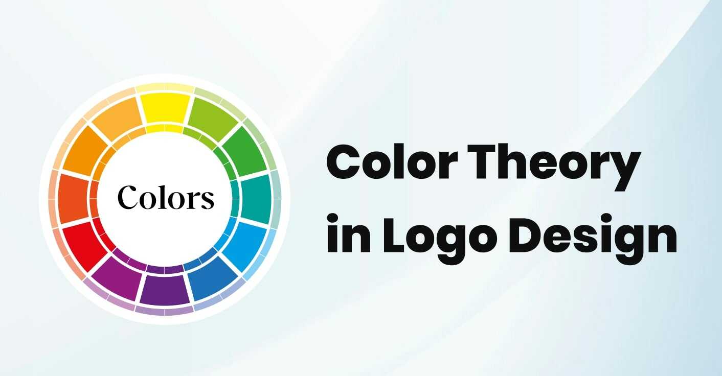
The importance of choosing the right color for your logo cannot be overstated. The right color can convey the right message about your brand and make a lasting impression on your customers. understanding the psychology of color in logo design is essential to creating a successful brand.
Different colors can evoke different thoughts or feelings that a person may associate with a brand.
As we gain more experience, we realize how crucial colors are for branding purposes. That’s why you’ll often see big brands release new logos that feature slightly different colors.
The company is attempting to create a new emotional connection with consumers by producing content that elicits positive feelings and thoughts about its brand. This, in turn, should result in increased customers and sales.
As we consider modern logo colors and common trends, it’s important to remember that color choice is a critical element of overall logo design. Below, we’ll explore some of the most popular trends in logo design, and examine why color is such an important factor in creating a successful logo.
If you are interested in a comprehensive logo design service, please contact our team today. We will work with you to ensure that your logo perfectly represents your brand.
Natural Colors
As we’ve seen, more and more businesses are adopting natural color palettes for their logos. What does this mean? Essentially, it refers to colors that occur naturally – those that you would see in nature. This often includes various shades of green, gray, and blue. Consequently, this trend suggests a move away from artificial or synthetic colors in favor of those that are more natural and organic.
Why are these sorts of colors being used more and more?
When you look at the psychology of colors in logo design, you’ll notice that natural colors tend to evoke very specific emotions. For example, green is often associated with feelings of peace and relaxation, while blue is often seen as calming and serene.
The use of grays can create a sense of balance, harmony, and neutrality in a composition. Blue, on the other hand, is often associated with trust and dependability. Therefore, it’s not surprising that many companies are now using natural blues in their logos.
Reliable, strong, calm, and peaceful businesses are trending because they inspire trust. Natural colors help create this feeling so it’s no surprise that they are popular.
Bright Colors
As we move into 2022, we’re seeing a trend toward brighter colors in logos. This is likely a response to the global events of the past year, as we seek to start anew and create a more positive future.
2022 has been a year of rebirth for many brands and people across the world as we finally fight back against the pandemic. The world has slowly returned to some semblance of normal, and brands want to emphasize this in their logos.
This year, we’re seeing a lot more bold and bright colors like yellow, orange, and red. These colors have traditionally been associated with optimism, confidence, excitement, and cheerfulness.
The trend of bright colors being used by brands is a reflection of the growing positivity in the world. This makes sense as brands look to express this to the world.
We will always have simple and effective black-and-white logos. However, we are seeing a definite trend toward more vibrant logo designs. We believe this is due, at least in part, to the pandemic.
Soft Colors
In addition to bright colors, we’ve seen a significant increase in the use of soft colors in many brand logos. While some of these trends may appear to be in conflict with each other, the reality is that it depends on the industries and businesses that are utilizing them.
Many B2B companies are choosing brighter colors to promote purchases and encourage optimism.
B2C companies are more likely to use softer colors in their branding. These colors create a sense of calm and reassurance for customers.
Two popular choices for kitchen colors are butter and olive oil. These colors tend to be softer shades of yellow or orange, which can help to create a more relaxed atmosphere in the kitchen.
Yellow offers a sense of clarity and optimism, while orange adds a touch of friendliness and cheerfulness to proceedings.
By using softer colors, you can create a more reassuring feeling.
In a world full of ambiguity and uncertainty, these softer tones are very welcoming for consumers.
Gradients
In 2022, you’ll find gradient logos everywhere you look. A gradient is a blend of different colors, rather than a single color. You’ll gradually move from one shade to another, creating a unique and eye-catching look.
The Instagram logo is an excellent example of how colors can be used to create a visually stunning and eye-catching design. The use of a yellow-to-orange-to-red-to-purple color scheme is a popular trend that is sure to make your brand stand out from the rest.
A gradient effect in your logo can be a fun and unique way to catch people’s attention, while still conveying the emotions you want. A good idea is to start with a base color, and then create a gradient from there.
Why Is Color Choice So Important?
If you are in graphics design or branding then you better know about the color theory and choice of theory is very important, how can I grow the choice of the importance in your round and for the best result we have been growing in the top
Why is it important to stay up-to-date with current color trends when designing a logo? Colors can play a big role in how recognizable and effective a logo is. Consider using colors that are popular or associated with your industry to make your logo stand out.
The truth is, color has a much bigger impact than you might realize. Here’s why:
Colors are psychological
The psychological impact of color is an important consideration when choosing colors for your brand. Different colors can evoke different emotions in people, so it is important to choose colors that are in line with the desired image for your brand.
Blue is a color that signifies trust and strength. It is often used by corporations that deal with finance and other important matters.
Many Fortune 500 companies, such as JP Morgan, American Express, and IBM, use blue in their logo design to convey trust and strength to consumers. In fact, 40% of all Fortune 500 companies use blue in their logo.
It’s important to consider the potential implications of choosing a logo color for your brand. A brightly colored logo may not convey the right message to customers.
Orange is more indicative of a company that is friendly and cheerful, rather than one that is focused and driven.
If you want your customers to view you in the right way, you need to be strategic about the colors you use.
Colors help with brand recognition
When thinking about logo colors from a brand recognition perspective, you have to take into account the psychological impact that colors can have.
Some of the world’s most popular brands are instantly recognizable for their unique qualities. Whether it’s a signature color, logo, or slogan, these brands have cultivated an instantly recognizable identity that sets them apart from their competitors.
The color of your logo can have a big impact on brand recognition. Studies have shown that using a colored logo can increase recognition by up to 80%. Colors are memorable and can help customers associate your brand with a certain color or colors.
If you saw yellow against a red background, your mind would probably associate those colors with McDonald’s. This is because their logo uses the same color scheme, which you’ve seen multiple times.
If you want people to recognize your brand and remember you, you need to use colors that are associated with your brand.
Colors draw people’s attention
The use of colors in a logo can be a powerful tool to capture people’s attention. However, it is important to note that a logo does not need to be colorful to be effective.
The color of your logo will immediately capture attention and stick in people’s minds, helping to increase brand awareness and recognition.
If we examine this more closely, it’s not even about the main color of your logo. Any color can work if it’s used in the right combination.
If you want your text to stand out, use a high-contrast color scheme like white on black. Learning how to use colors effectively can help you attract more attention to your business.
Enjoy Expert Logo Design Services Today
Colors are an important aspect of any logo, and it is crucial to understand which colors work best for your brand identity. Thankfully, you are in the right place for advice on this matter.
At TechUptodate, we offer a comprehensive logo design service that will cater to all of your needs. Our team of experienced professionals will help you develop an eye-catching logo that capitalizes on the latest color trends while ensuring your brand gets across the right message.


